
levelthecurve.com Redesign
A website redesigned to balance the company's story and product marketing to appeal to potential customers and investors.
Organization
Level the Curve Inc.
Skills
UX/UI Design
Human Centered Design
User Research
Wireframing
Prototyping
Journey-Mapping
Digital Accessibility
Tools
Figma
HTML
CSS
Problem
Level the Curve was facing stagnancy with engagement on their website. This stagnancy caused them to miss out on customers and investors that visited their website.
User Testing Feedback
Lack of User Retention
40% of users finished the flow
Users were thrown off by video at the top of the homepage
Continuous scroll contributed to fatigue amongst testers
Navigation Issues
Of people who were interested in purchasing products:
Only 20% of users were able to navigate to the shop
Accessibility Pain Points
60% of users with sensory and physical disabilities struggled with:
processing information
clicking elements
50% of screen reader users reported confusion with text to speech output
Goals
Balance interactivity and simplicity
Make website interactive enough to increase user retention
while reducing clicks when necessary
Design UI to convey company values
Changes such as a hero header with a tagline and a visual-based list of values
will foster more empathy in visitors
Ensure the website provides clear messaging to attract new customers and investors/donors
Appeal to both potential donors and customers
Ideation
Inspiration
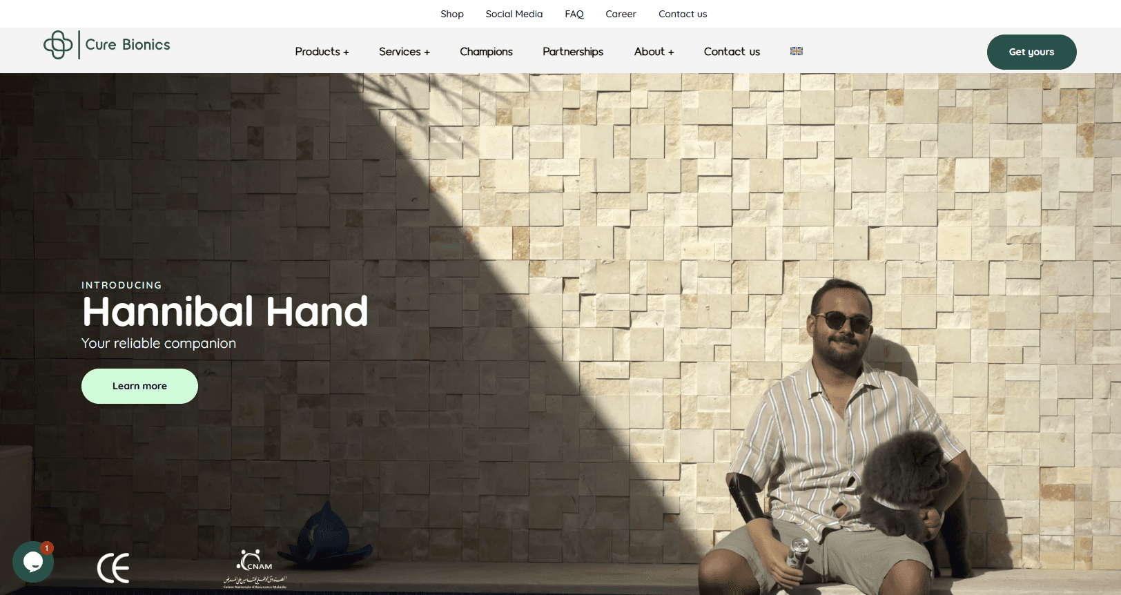
Cure Bionics
Purposeful hero header
Neatly-organized information
Consistent colors
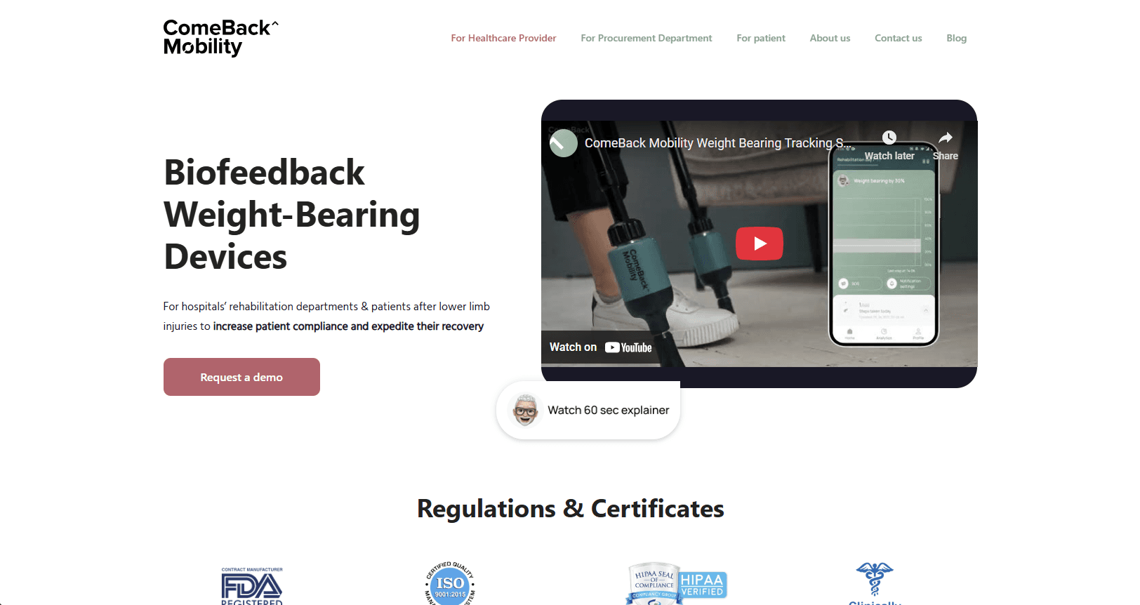
Comeback Mobility
Good spacing — breathable feel
Hero header highlights company's product
Mind Mapping
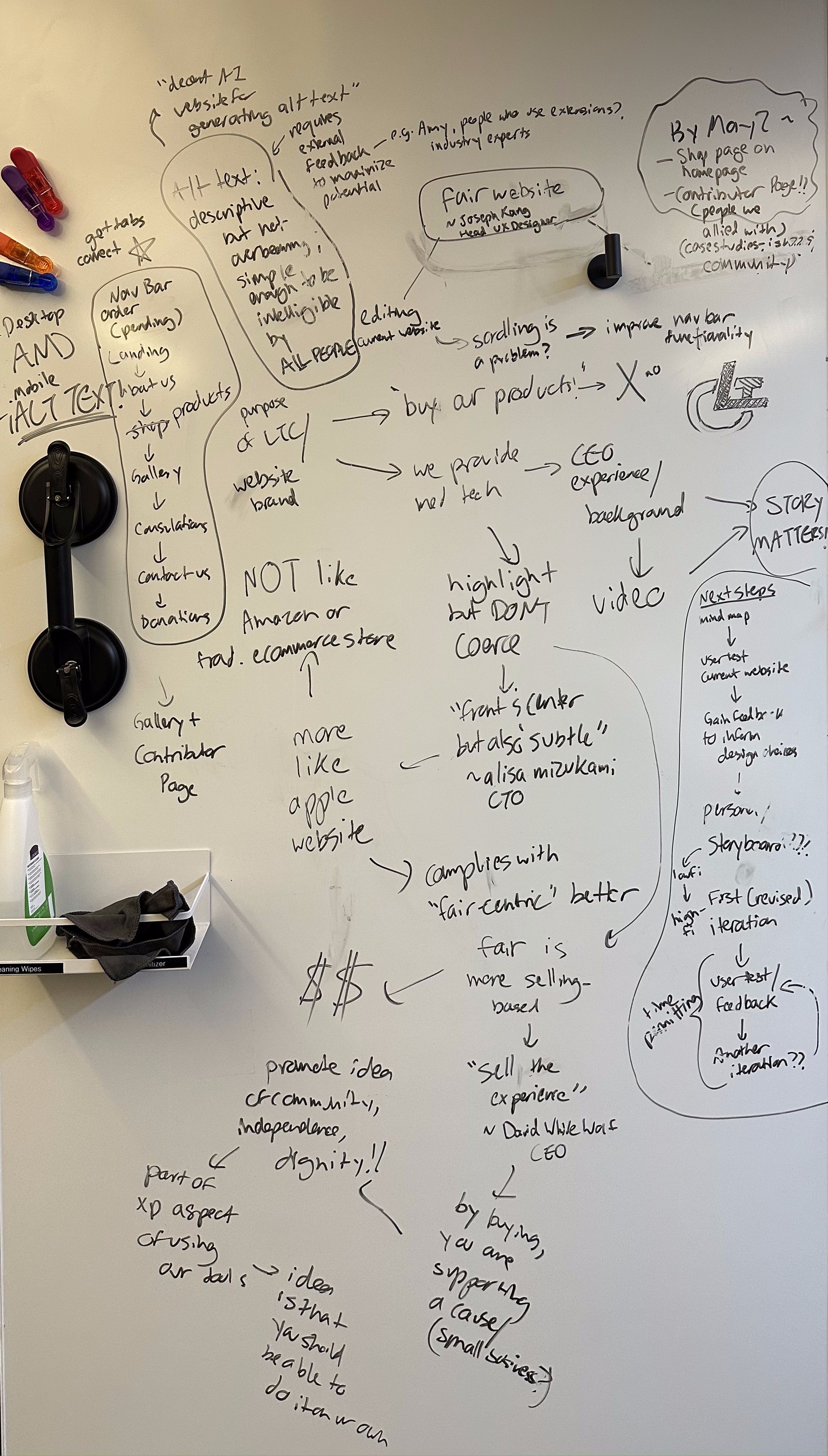
Highlights:
Planning Nav-Bar Layout
Determining how to convey the background story while promoting products
Accessibility features (e.g. alt text)
Design
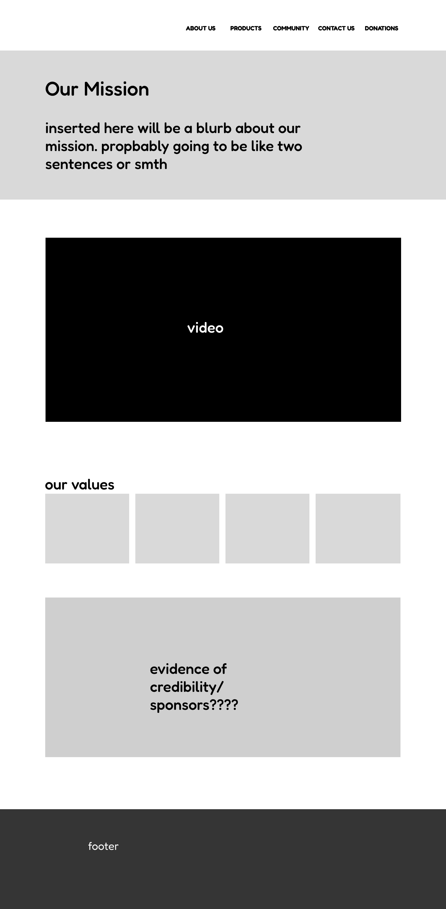
Low-Fi Wireframes
Homepage
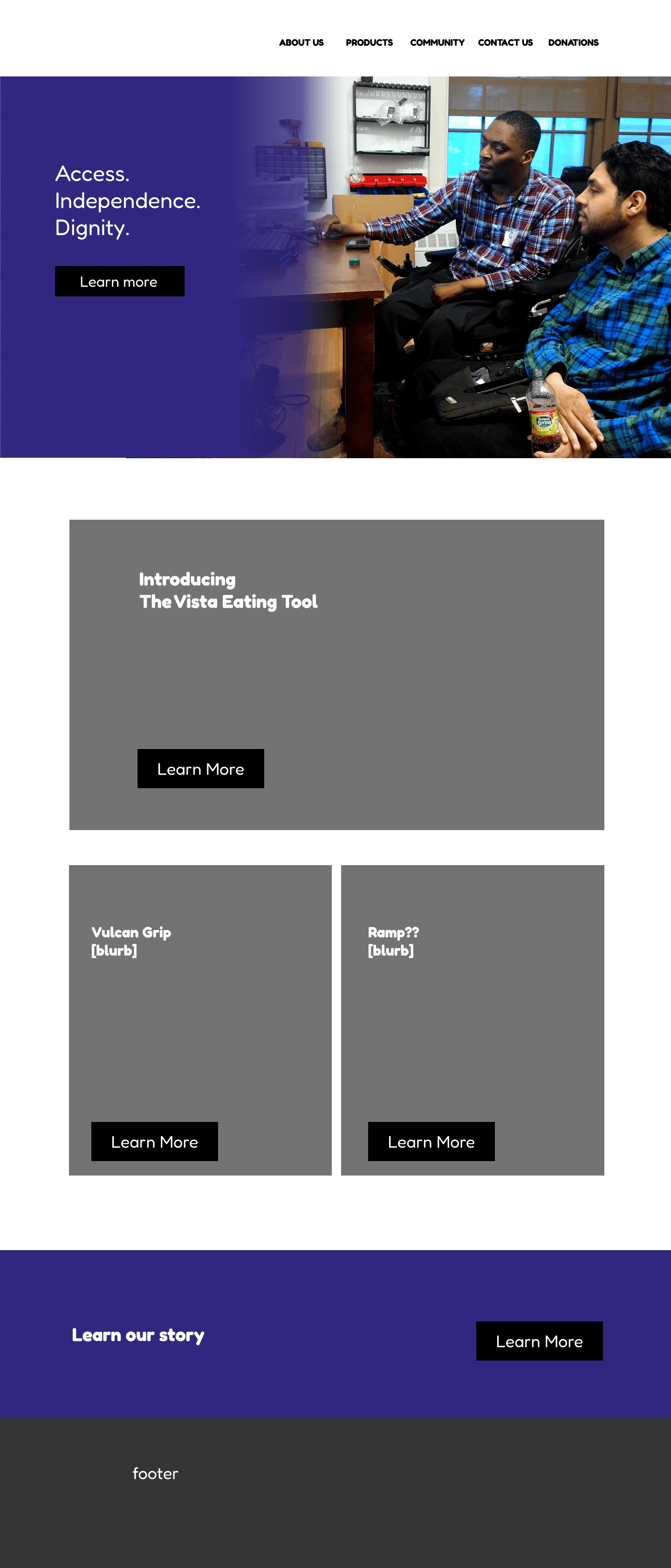
"About Us" page
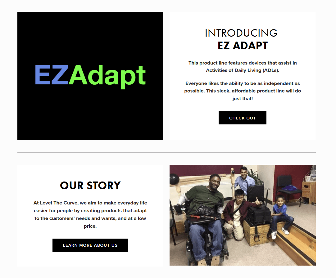
Website Redesign
Hero Header
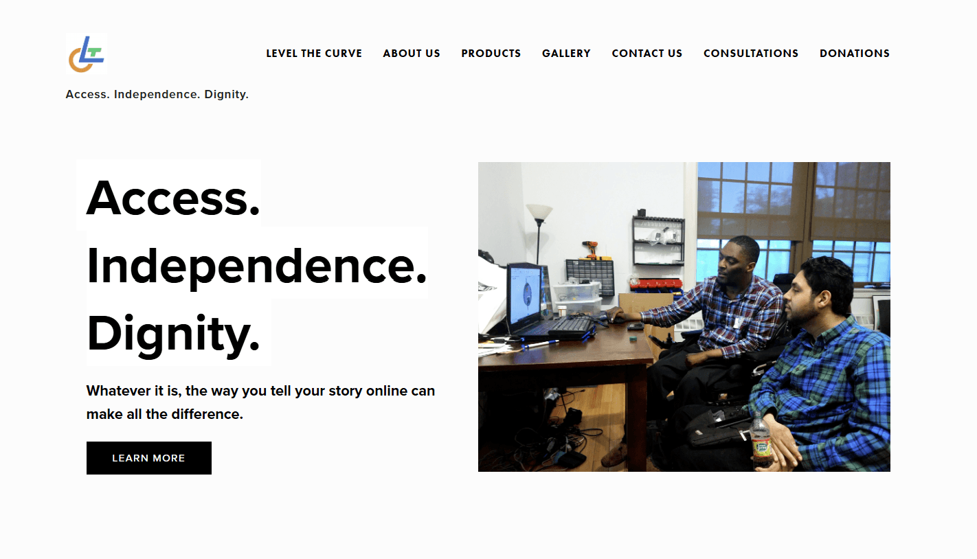
Homepage:
Brief summaries of each page supported by a visual
Aimed to give basic ideas of respective pages while avoiding overwhelming users
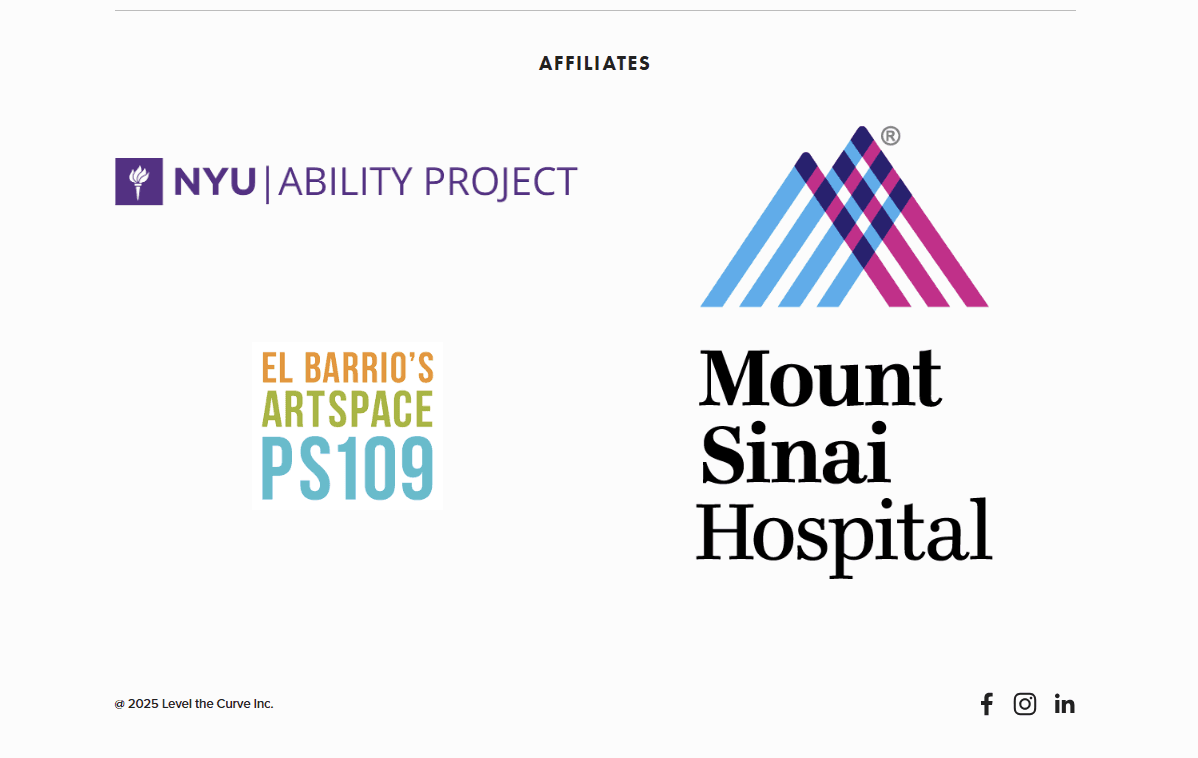
Display of affiliates to show credibility to potential investors and donors
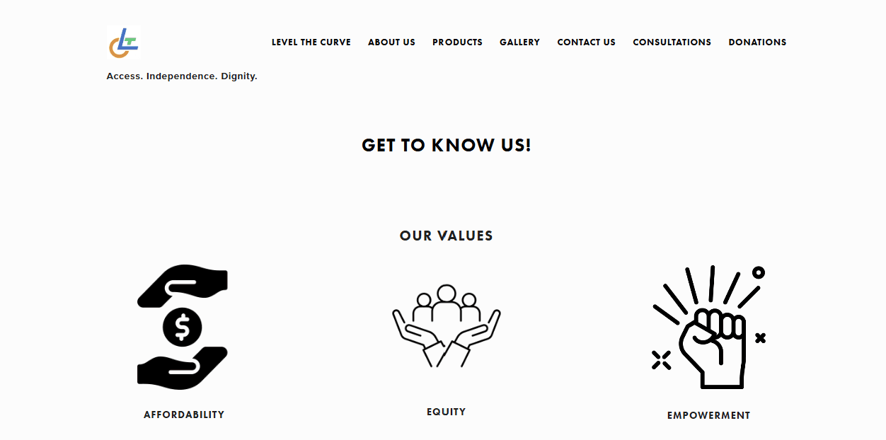
Visual list of values to highlight company's personality
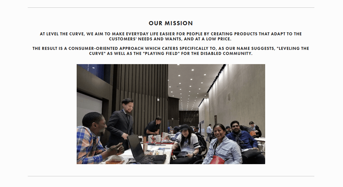
Mission statement accompanied by picture to help retain attention
Next Steps
Interactivity for "About Us" page
"About Us" page is visually appealing but it would be worth exploring ways to make it interactive to further increase retention
Displaying community projects
Using the new "Gallery" page to not only show company pictures but to also highlight works by people with disabilities
Further improving on accessibility
Outside of layouts and alt text, I will continue to look out for opportunities to improve the website's accessibility through accessibility checkers and user testing
@2025 Joseph Kang